Student Housing
Building the blueprint for student housing’s brand system.
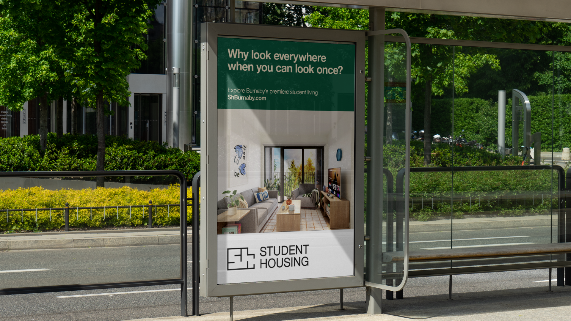
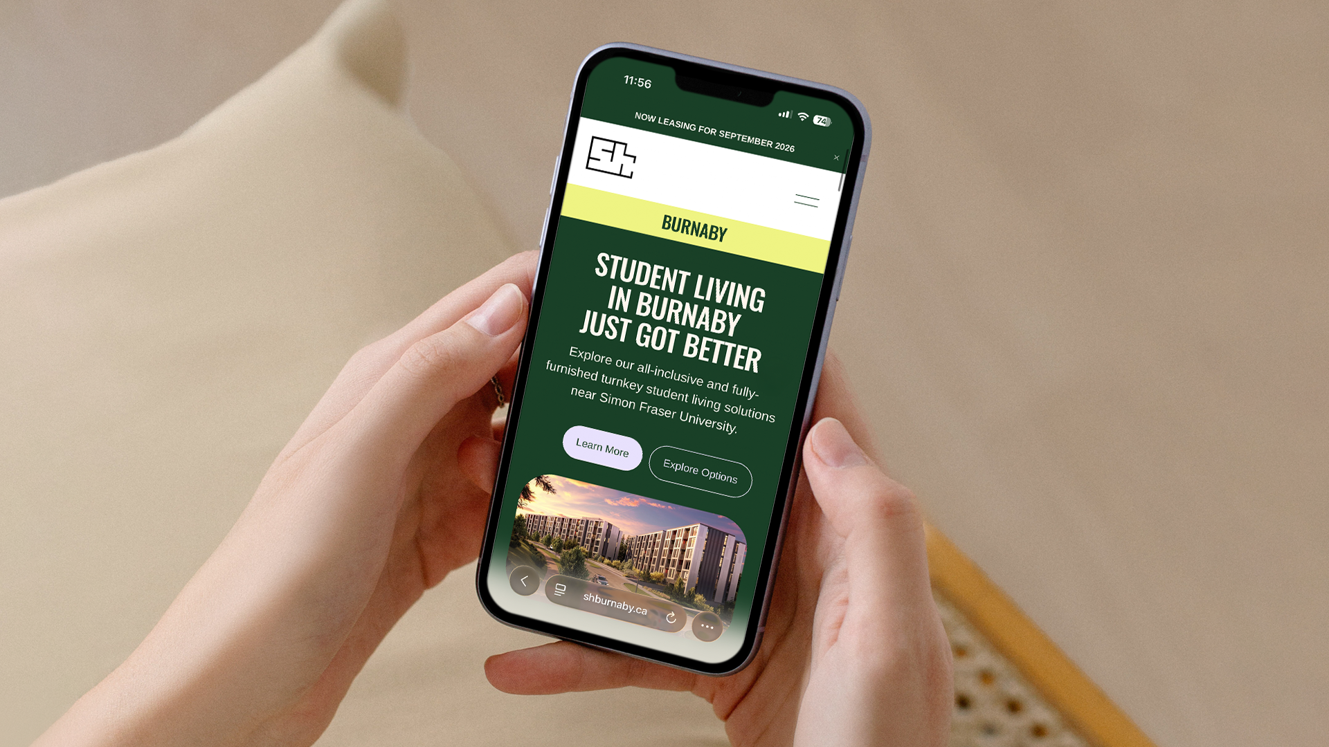

Student Housing unifies a growing portfolio of student properties under one clear, cohesive system. Rather than treating each building as a standalone brand, the name positions the portfolio as a single destination for modern student living across cities and communities. Simple, direct, and functional, it speaks to clarity, scale, and ease.
The identity is built around structure and planning, drawing from the language of architecture itself. The logo takes the form of a floorplan shaped into the letters SH, merging space and name into one symbol. Clean lines and geometric balance reflect how students move through, live in, and connect within each property.
Together, the name and visual system create a flexible framework that allows each building to retain its own character while feeling part of a larger, trusted network. Student Housing becomes more than a collection of residences, it becomes a unified brand experience designed to grow, adapt, and scale.
Services
Logo
Identity
Strategy