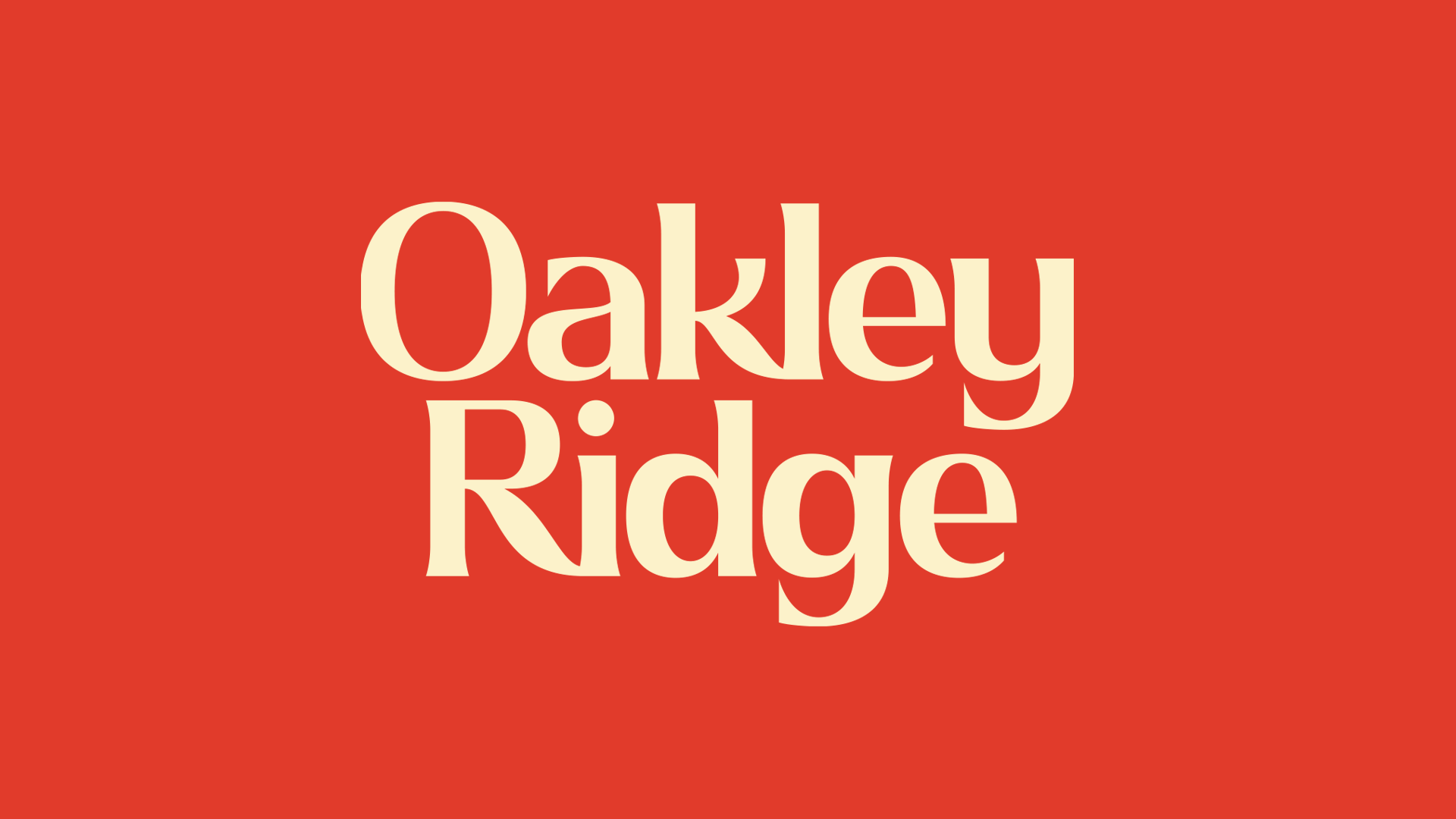
Oakley Ridge
Giving Guelph’s modern student living an established look and feel.


Starting with a pre-established name, the task was to bring new life to it through a refreshed, timeless identity. Rather than reinventing, the brand reclaims what already existed, elevating it with intention and clarity. The positioning leans into permanence over trends, creating a place that feels rooted, dependable, and built to last.
The visual direction draws from the natural landscape surrounding the property. Rich, grounded colours reflect the trees, earth, and changing seasons, grounding the brand in its environment and giving it warmth and depth.
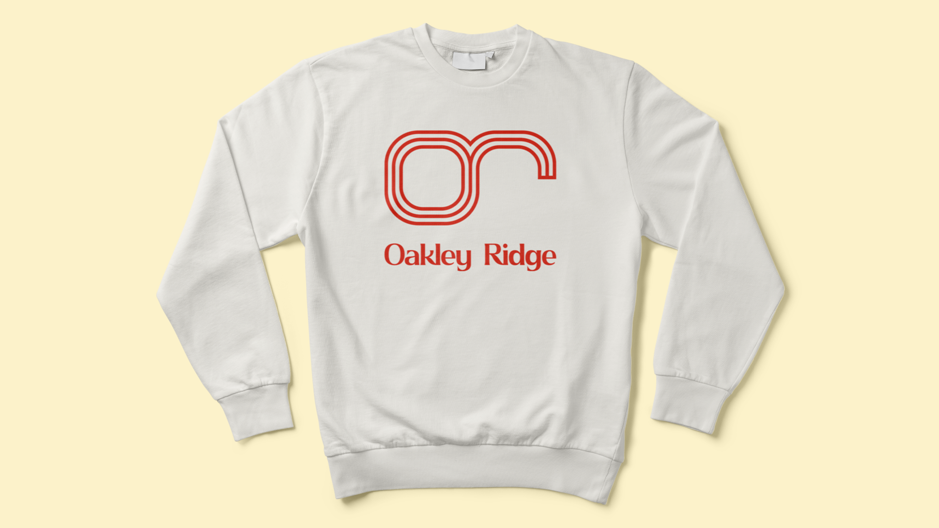
The logo takes a modernist approach. Thick, confident lines form one continuous, unbroken symbol that spells lowercase initials “or”. The simplicity speaks to strength and stability, while the fluid construction adds a contemporary edge. The result is a bold, timeless mark that anchors the new Oakley Ridge identity and carries it forward.
Services
Logo
Brand Identity
Strategy